
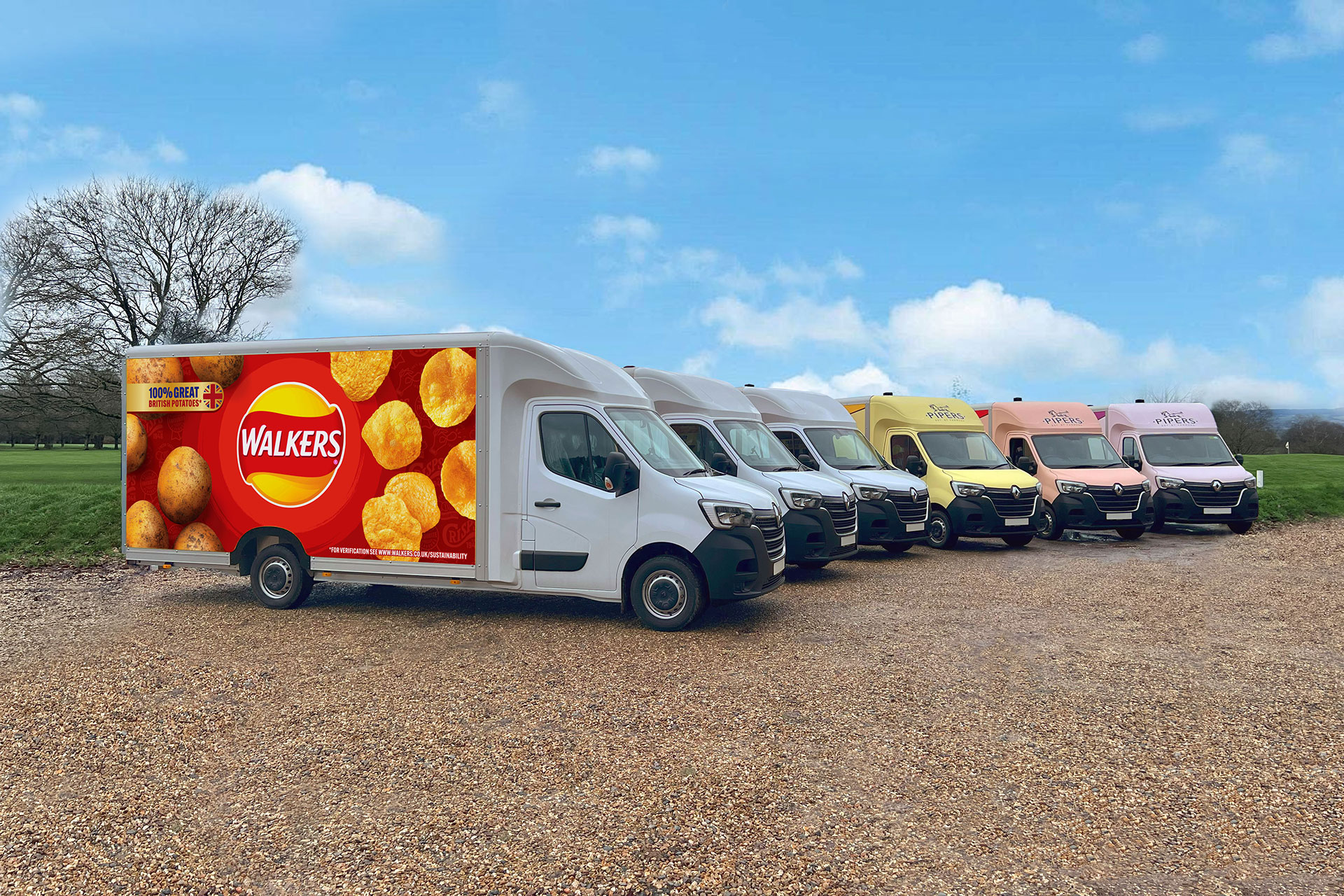
Vehicle livery is a great way to advertise your business while traveling. Whether you’re a sole trader commuting between jobs, delivering goods, an international company with a fleet on the road, or a leisure venue or attraction, you can optimise customer interaction with attractive signage on the move.
We’ve put together this set of useful tips to help highlight how vehicle livery could assist in showcasing your goods and services.

Our expert team can assist you with recommending font sizes, typefaces, and the placement of graphics to maximise engagement. Proper placement is key—information positioned below the line of sight or wrapped around two sides of the vehicle can be hard to read and less effective.

Another important aspect of a quality vehicle livery is what not to do. There’s plenty of information out there on design layouts and colour schemes, but there are certain practises to avoid in order to maintain an effective advertisement.
Unless the image directly relates to what you do or the goods/services you offer, it’s advised not to use photographs for your livery. Often, photographs can create an overly complex and difficult-to-read design, which can deter potential customers.

Wrapping information about your business around your vehicle may seem like a good idea, but it can often obscure essential details depending on the direction from which the viewer is approaching.
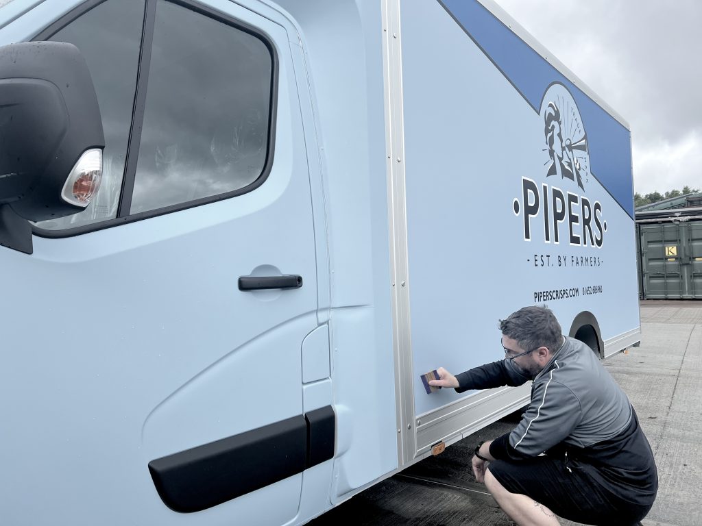
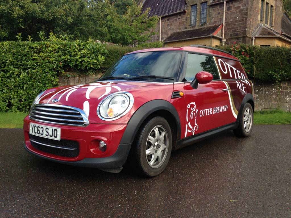
Find out more about our vehicle livery services here, or get in touch with our expert, friendly team.
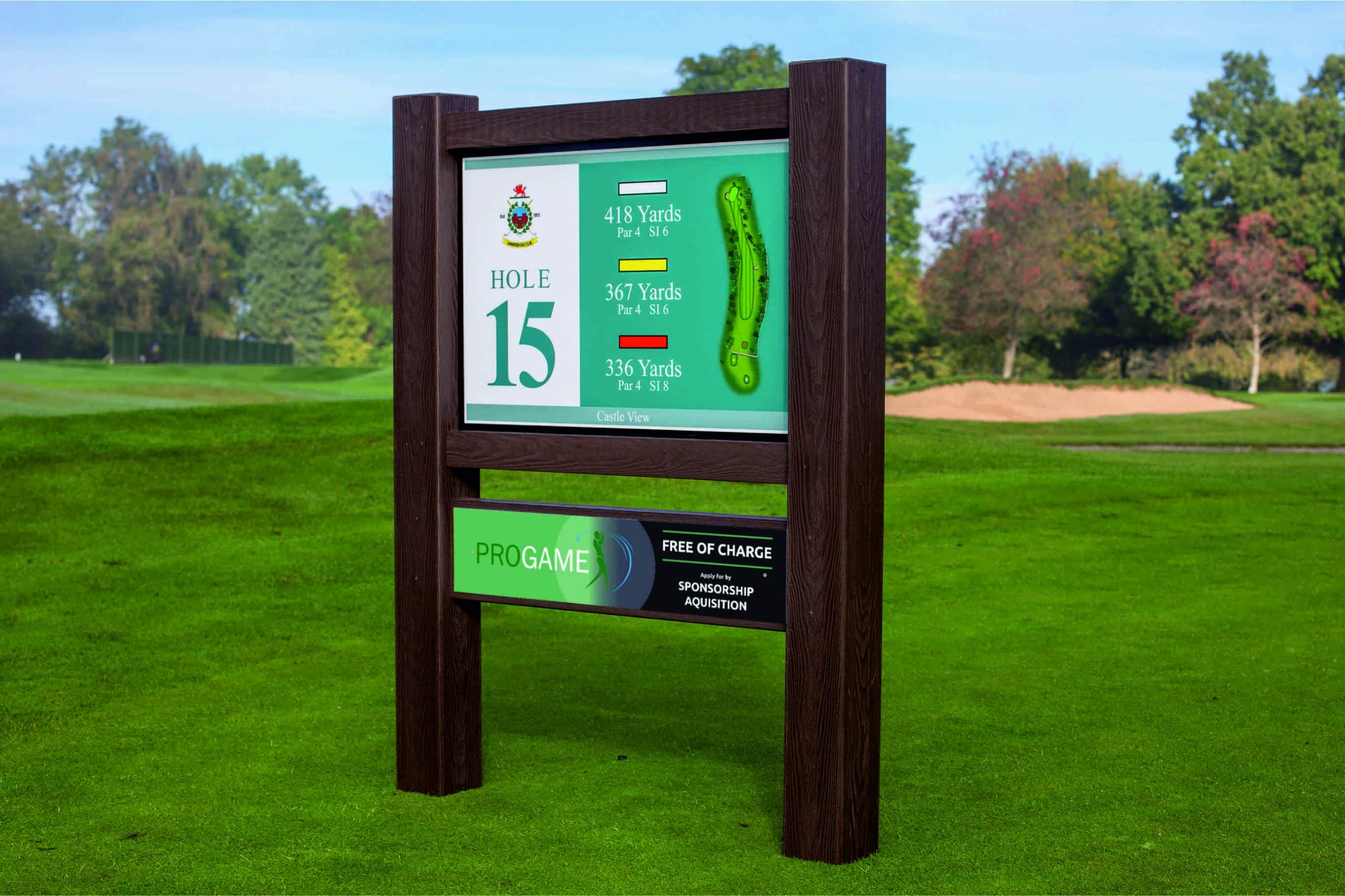
Hands Up – Who’d Like Some Free Championship-Grade Golf Signage? Did you know that Ken White Signs exclusive partnership with PROGAME brings championship-quality tee signage

Vehicle livery is one of the most effective and cost-efficient ways for businesses—large or small—to increase visibility and enhance their brand presence. Whether you’re a sole trader or a large fleet operator, vehicle wraps, decals, and vinyl graphics offer an incredible return on investment.
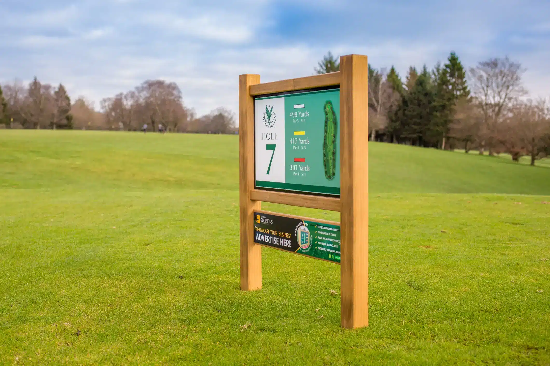
Now is the time to prepare your golf course for spring as golf enthusiasts eagerly anticipate their return to the course. As a golf course
© 2023 - The content of this website is owned by Ken White Signs Ltd; copying of any content (including images) without our consent is in breach of our Terms & Conditions. | All rights Reserved