
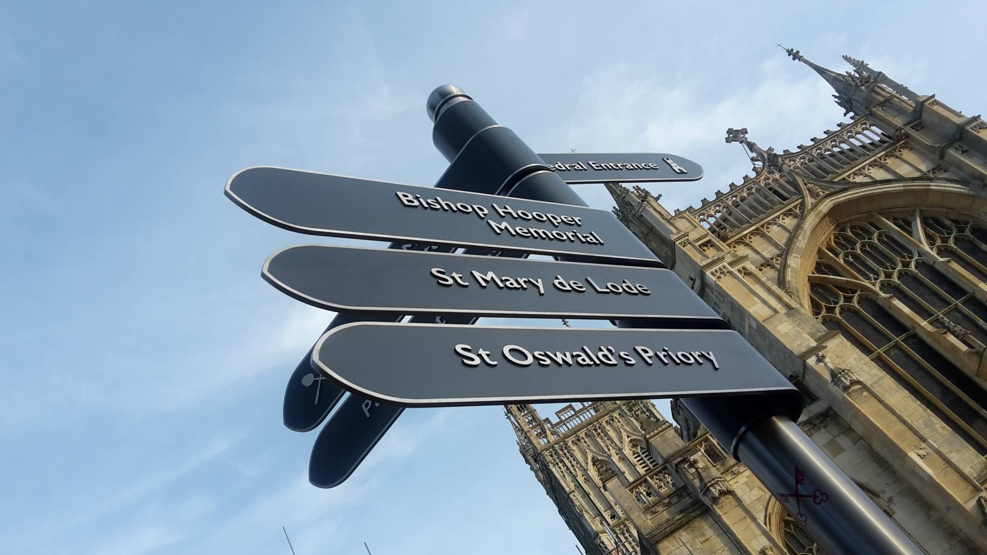
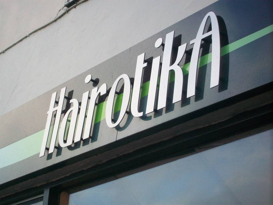
When creating signs for businesses it is essential to look beyond the initial aesthetics and consider brand awareness and intent too. Have you ever noticed how certain business signage has the power to hold your attention, while others pale in comparison? Well, if you’re focus is drawn, then so will that of your potential customers. From the font that you use to the size that you choose makes a statement about your business. So, in our blog, we’ll explore ways you can make sure your company makes the right one!
Contrary to popular belief, bigger isn’t always better. In fact, in some cases less can be more. Minimalist designs can be just as impactful and, if your company is already well-known, a small sign may sum up everything you need to say. That is not to say that big is bad. Large signage, such as billboards, vehicle livery or custom fascia and wall mounted signs can be equally effective. Consider what size sign is best for your business in line with your other branding materials. An expert sign designer can provide guidance on this.
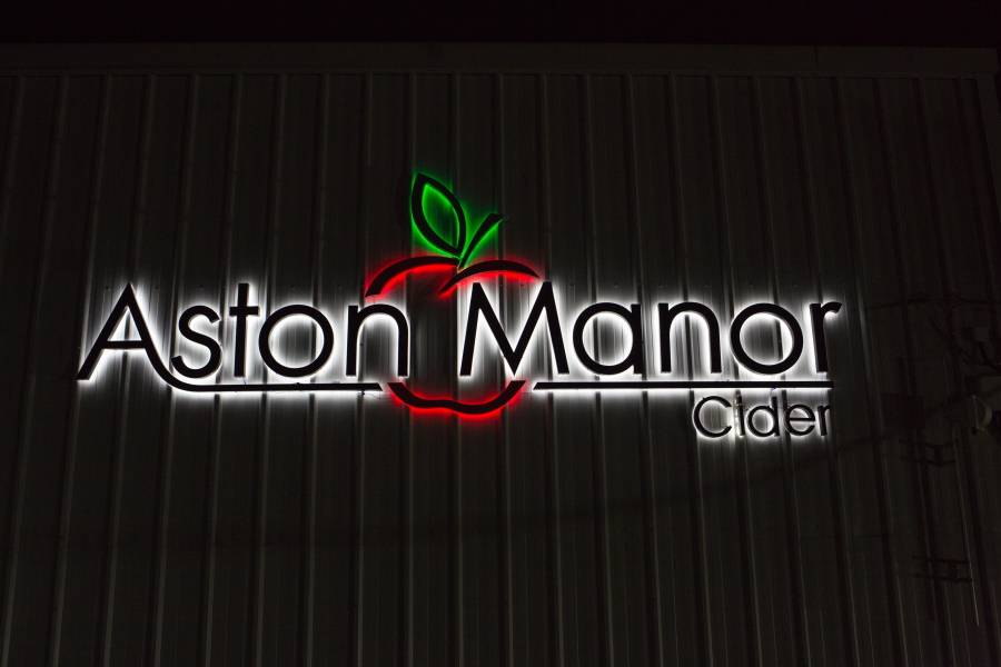
Neon or LED signs are a fantastic way to promote your business and catch the eye of passers-by; particularly if you operate at night. Supermarkets, nightclubs, bars, hotels, restaurants and even car showrooms, have been known to use light to their advantage and substantially enhance their business signs.
Making your signs useful or interactive can make then significantly more memorable. As a result, you can boost public relations and even increase your customer base and productivity. For example, in 2013 IBM produced a series of memorable and highly popular street furniture signs for their ‘Smarter Cities’ initiative, consisting of a bench, rain shelter and ramp. Ways to make signwork useful could include:
A designers least favorite phrase, but making your sign stand out is a sure fire way to garner attention from your customers. However, it may be worth having some ideas as to what exactly will add a bit of ‘pop’ to your installation. Consider:
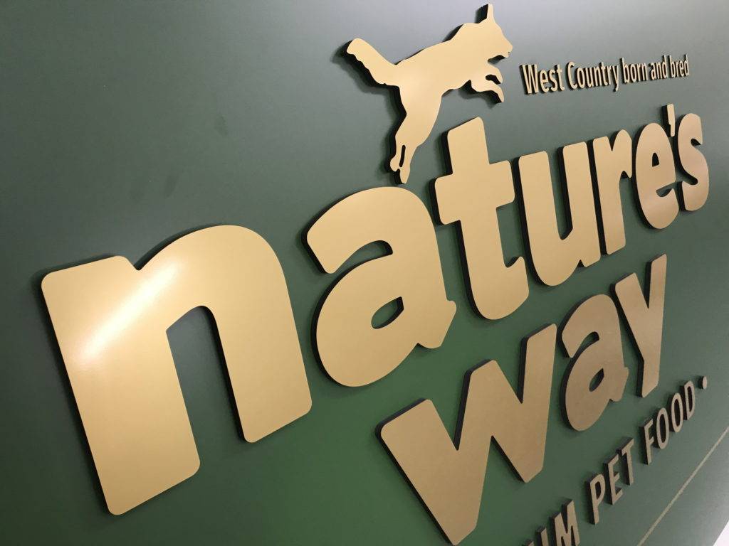
Ultimately, unless you work in design yourself, it is worth consulting an expert when creating signs for businesses. Ken White Signs has been designing, building and installing custom signs across the UK for over 25 years and is able to offer professional advice and design services. So, whether you need premises signs, wayfinding signs, promotional items, or something completely unique, get in touch for a free quotation on 01884 253 795.
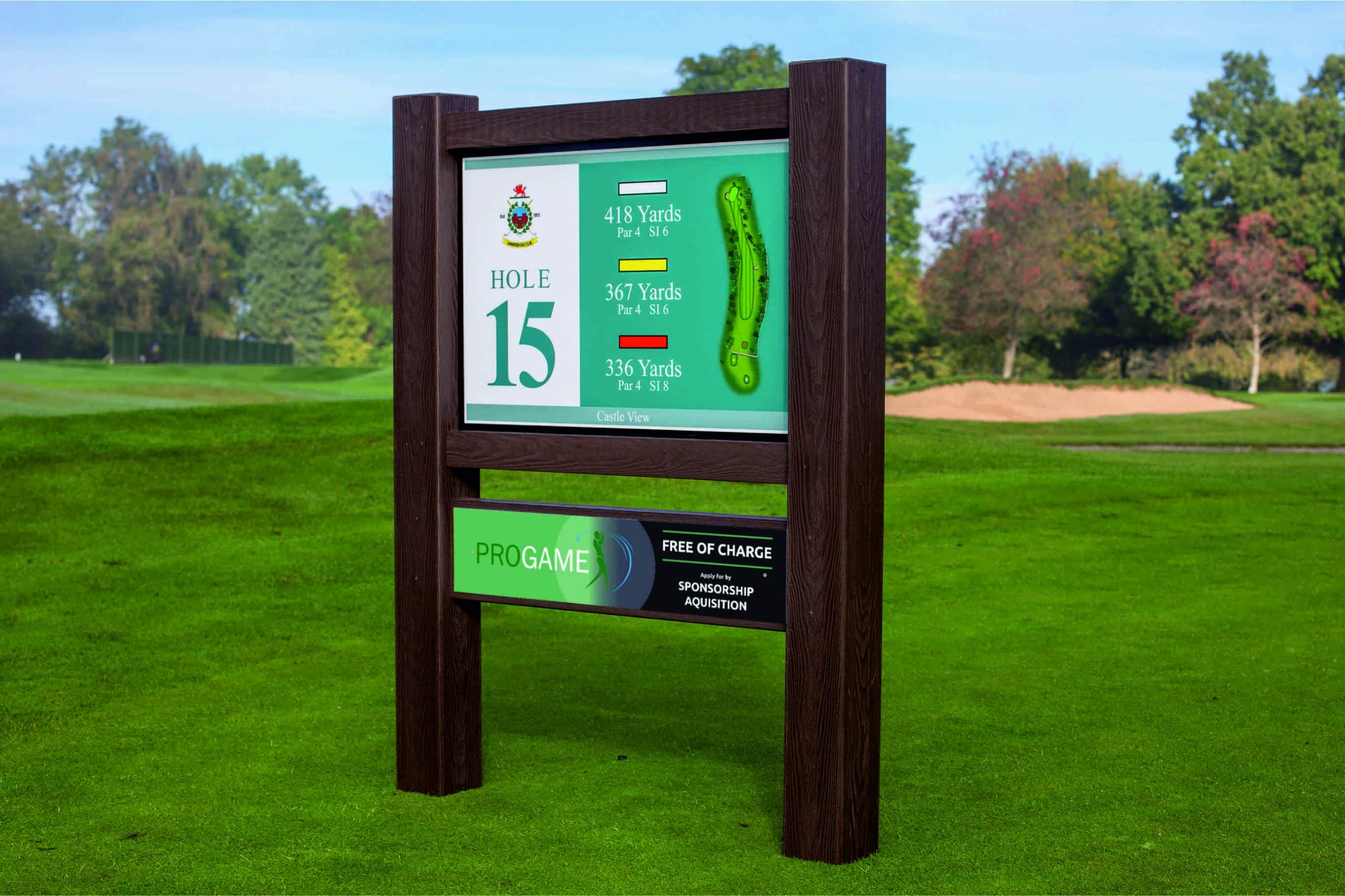
Hands Up – Who’d Like Some Free Championship-Grade Golf Signage? Did you know that Ken White Signs exclusive partnership with PROGAME brings championship-quality tee signage
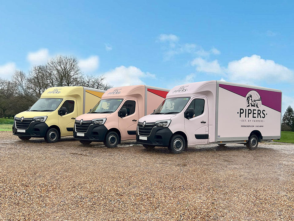
Vehicle livery is one of the most effective and cost-efficient ways for businesses—large or small—to increase visibility and enhance their brand presence. Whether you’re a sole trader or a large fleet operator, vehicle wraps, decals, and vinyl graphics offer an incredible return on investment.
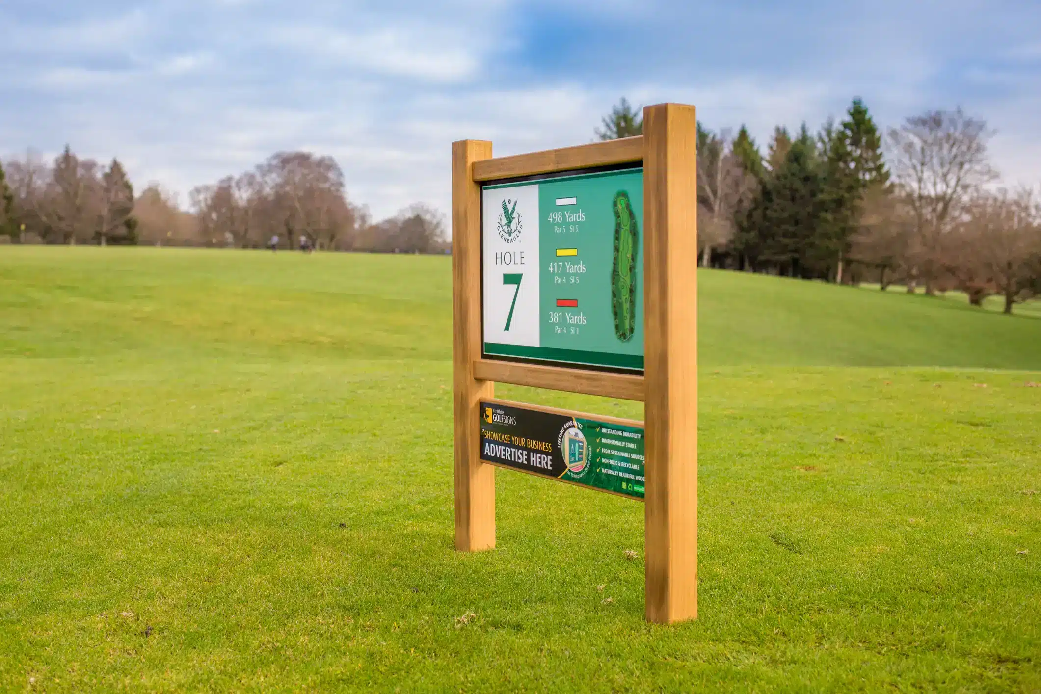
Now is the time to prepare your golf course for spring as golf enthusiasts eagerly anticipate their return to the course. As a golf course
© 2023 - The content of this website is owned by Ken White Signs Ltd; copying of any content (including images) without our consent is in breach of our Terms & Conditions. | All rights Reserved